Brave New World
|
Description
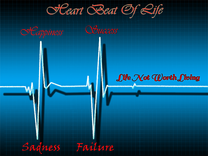
I decided to focus on how sadness effects happiness. And how there are different kinds of happiness. As well how failure effects success and how all these things put together make are likes fulfilling |
Reflection
1) I chose to make my poster on Photo Shop instead of by hand because I wanted to be able to change the the color scheme, drop shadows, font and other elements with ease so that I could compare different versions to be able to pick the best one. As well when I started I did not have much of a vision of what I wanted it to look like. So Photo Shop enabled me to make it as I go and not have to have a detailed sketch of what it was going to look like.
2) I used the red as a worm color with the blue, black and white to make contrast and a worm feeling that was not dark. The font played a big role in the emotion of the piece as well. I was able to use a variation of font for eye movement. I used a darker feeling font for the sadness and failure, a happier/soft font for the happiness and success, and then one in between for the like not worth living. this make it a good diversity and helped support my idea of my paper more.
3) If I was to do it all over again I would still make it in Photo Shop but would of spent more time with changing the colors around and make different effect's to make it a little more loud and more appealing to the eyes. I also started really late in the game with a idea and I really regret that now because I had very little time for revising. As well I wish that I would of downloaded more brushes and fonts because I was very limited on my options.
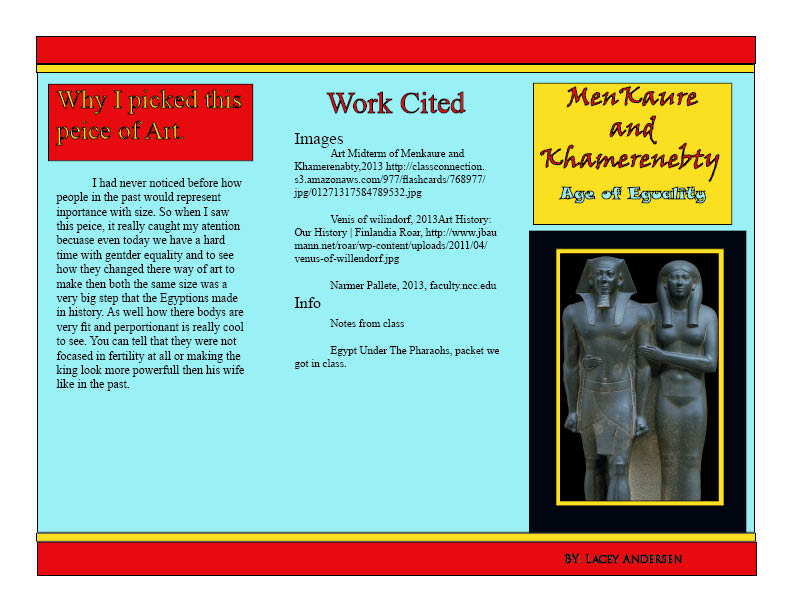
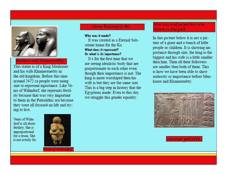
Egyptian Brochure
In class we took a week or so to look at art history and at the end we took the one piece of art that we liked the most and made a Brochure with all the history and facts about it. We also learned how to use Adobe in design, we were just going to use a pre made temples but it did not work out so we made them from scratch. Roxy wanted us to learn how to insert text, pictures. colors, gradients and how to ad in dividers
|
|
Pre Historic Art
|
|
In class we went back in history and looked at how art developed through time. We started with a side view and this was when I drew this. We then took it into Photo Shop and Adobe Illustrator and live traced it to see the different kind of effects that I could make. All the pictures I have of my Buffalo are just different simple versions that i made in illustration and PS.
|
Stop Motion Animation
|
|
in class we learned how to make stop motion animations. We started with taking a LOT of pictures and then put them all together in Adobe Illustration and learned how to take all the photos and turn it into a movie with videos in it and sound. we used a lot of golden section and and other photography that we learned in the past. We ran into a lot of problems at the end with
|
Photography
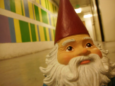
Wide depth of feild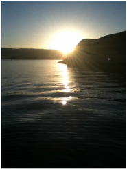
Wide depth of field is when every thing is in focus. meaning nothing is blurred. This photo also demonstrates the magic hour giving you all kinds of lighting, like reflective light, transmitted light, and hard light.
|
|
Poster For Greek Tragedy Play
The goal for this project was to make a poster for our Greek Tragedy Play. it was supposed to be a peace of advertisement to get people to watch are play. I think that my poster reflects my play and the poster turned out really good in my opinion. We were not given very little recommendations. It also gave me more work in photo shop intern letting me learn more and get better.
Questions
1) What makes for a engaging movie poster?
It needs to stand out, set the mood, establish a brand, and as well should have good quality. Very in portent as well is to give a feeling for what the movie will be like rather than telling you out-right. Because you want it to hook people and want them to go and watch it to get the hole story and ending . When you put all of these together as well as the art principles and elements like line, shape, form, texture..ect in unison it make a engaging poster.
2) How and why is art used as a vehicle for communication?
By using worm colors or cool colors is one of the best ways to express emotions and feeling. As well as the use of space, contrast, emphasis and more. These help to get the full emotions across some times when people cant express there feelings in words and its easier to express there thoughts or emotions on paper with colors and lines. In a way that is not possible with for some people to express in words. Art has been used to tell stories or feeling even before writing was
3) To what extent does a work of art depend on the viewer's point of view
I think it all depends on the kind of art. For instance abstract art is 100% about how the viewer sees it. Two different people could see totally different things in one peace of art. But on the other hand like a poster when you make it you want your viewers to all see it the same and get the same thing out of it. You do not want the person to be scared or one have a warm feeling. Normally when you are painting some thing you are painting it for your self but when you make a poster or some thing like that you are making it for the viewer. You are creating some thing they want to see. not what you want to see or like.
How to Videos
We had a week to just pic any how to videos in photo shop and try to do it are self on are own picture. My favorite how to videos for shore was how to change hair color. I had so much fun changing Carrie Underwood's Hair color. It turned out some much better then I could of ever imagined. As well I learned a lot in photo shop, like new tools, and different elements. My baby is pretty scary two, even tho the two eyes are different colors it was a good learning experience for me in photo shop.
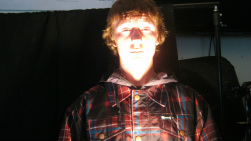
Teacher Animal Poster Project
Nick Manning the Hippie
This was my first big project with photo shop. i had a big learning curve considering i had never used this program before. I had a lot of fun messing with Nick in this project. There was a lot of unexpected defects that i found with my original hippie picture, like he did not have a right hand. So I had to make a new one and get it to look like the rest of his body. all and all tho i was really happy with how it came out in the end. Every time i look at it, it makes me laugh.
This was my first big project with photo shop. i had a big learning curve considering i had never used this program before. I had a lot of fun messing with Nick in this project. There was a lot of unexpected defects that i found with my original hippie picture, like he did not have a right hand. So I had to make a new one and get it to look like the rest of his body. all and all tho i was really happy with how it came out in the end. Every time i look at it, it makes me laugh.
Name Project
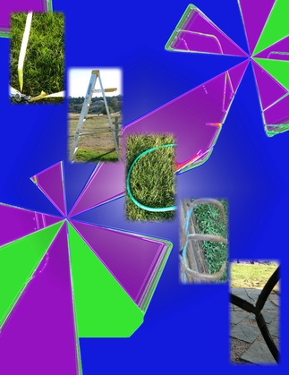
This was my very first project in Digital Art. It was really fun taking all the pictures to use for my letters. It took me a few days to get them all but in the end they came together okay. I was really happy with it when I made it because it was my very first time with photo shop. And had No idea what i was doing. I learned a lot of things in this project as well it was nice to be able to get out of the class room to get all the pictures.
3206 North Main Street Durango, Co 81301
school phone 970 247 2474
school phone 970 247 2474
